Glasgow School of Art
MDes Communication
Design;
In Good Faith
![]()
![]()
![]()
![]()
![]()
![]()
![]()
![]()
![]()
![]()
![]()
![]()
![]()
![]()
![]()
![]()
![]()
![]()
![]()
![]()
![]()
![]()
![]()
![]()
![]()
![]()
![]()
My final project for my masters.
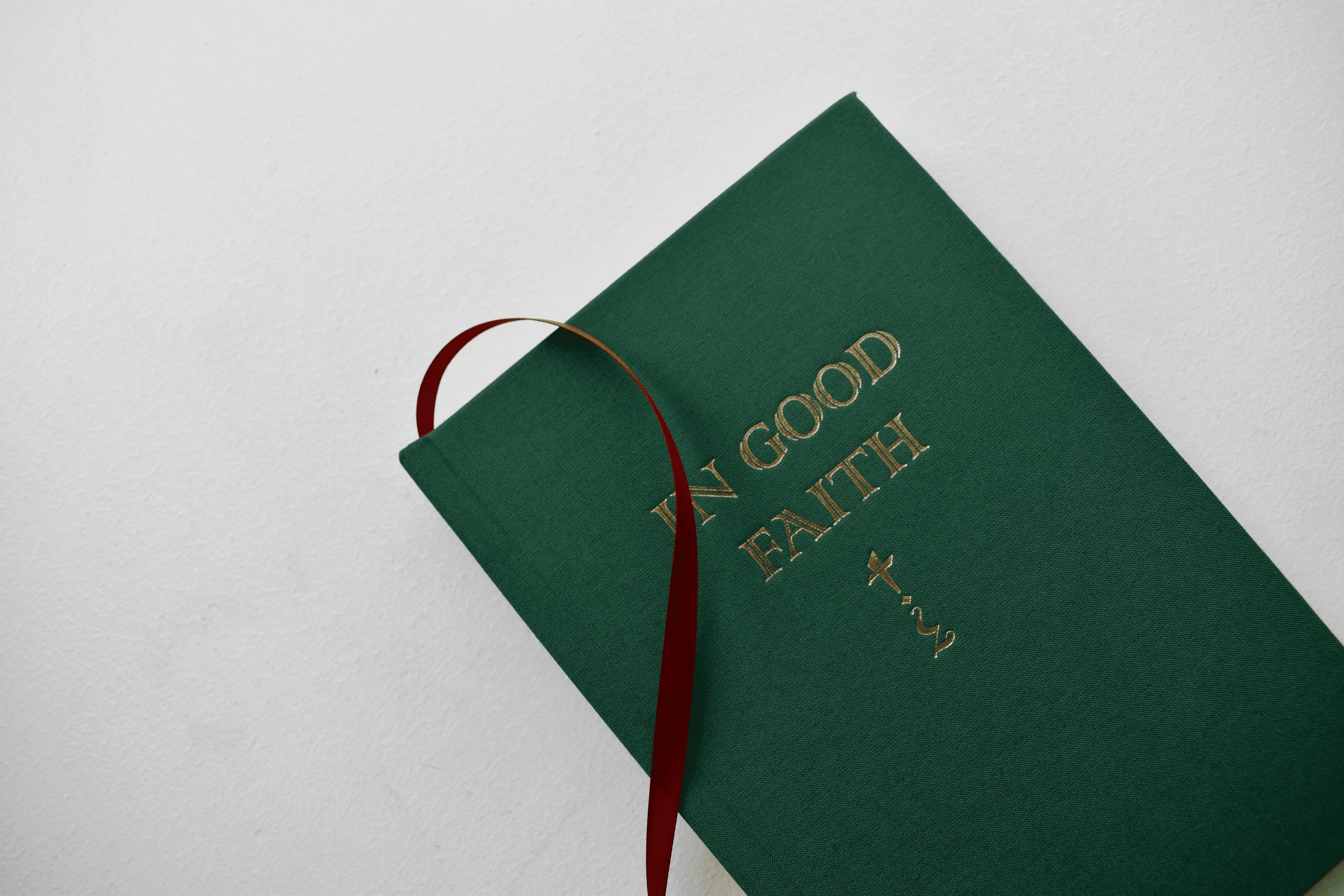
'In Good Faith' explores my unusual childhood, growing up with parents who are both priests in the Church of England.
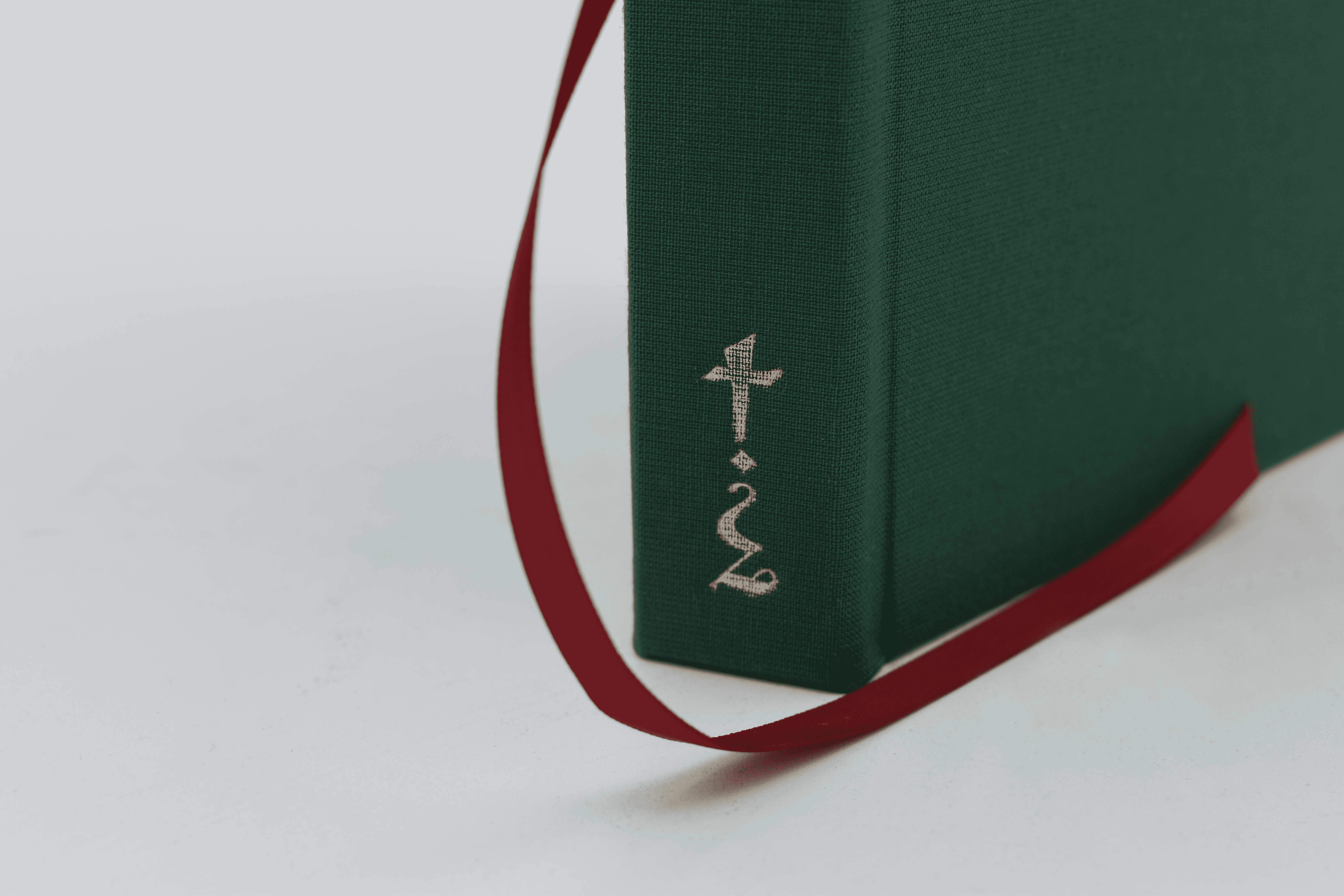
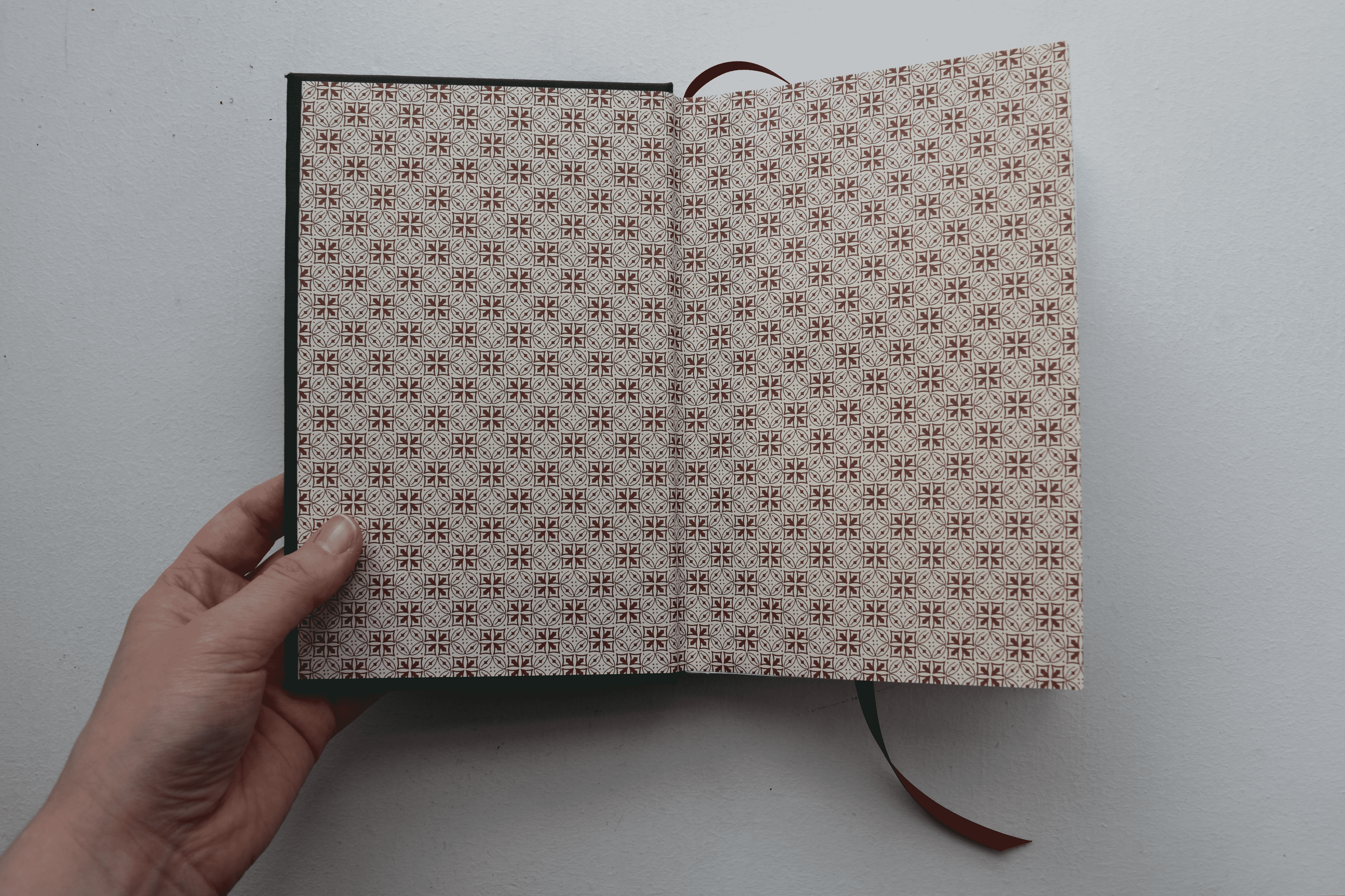
Through a series of original interviews, the book is a personally curated investigation into the concepts of faith, family, and doubt that frame my childhood memories and inform my present-day. 'In Good Faith' is a hand-bound a book inspired by the visual language of Bibles and the New English Hymnal. I created punctuation glyphs to represent the concepts of faith, doubt, and a paradoxical mixture of the two to highlight important passages throughout the text. A personal reflection on my nuanced relationship with faith that sits within my cross-disciplinary practice.
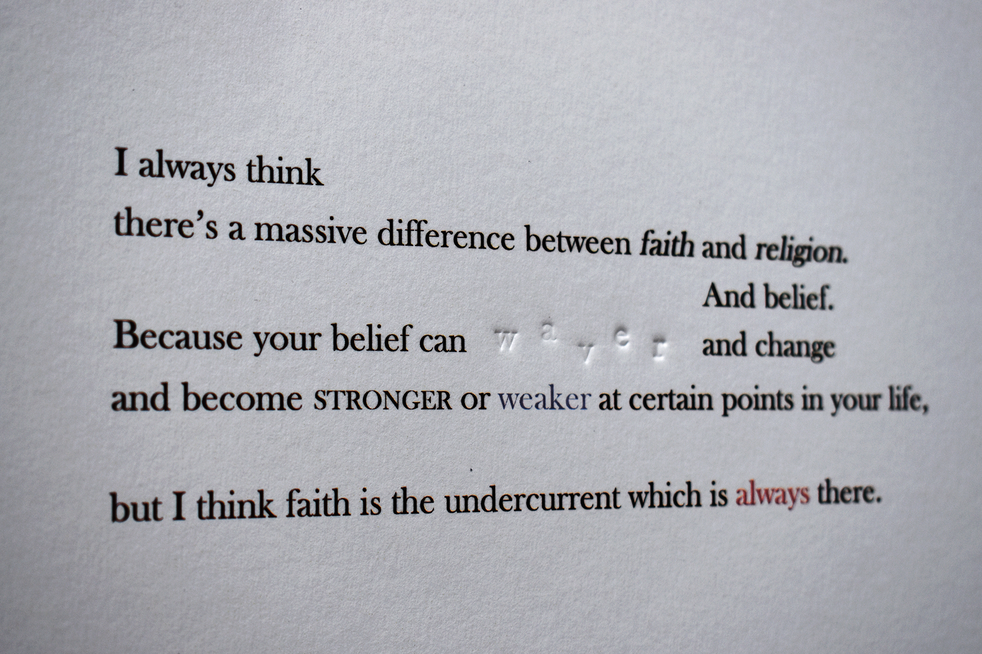
Even within the formal typographic style of the book, I was very interested in capturing the natural speech patterns in text including such verbal quirks as 'um's, 'ah's, interruptions and the like as I felt there was a beauty and power in being able to 'see' the thoughts expressed emerge into being. However, I wanted to explore further the potential of representing natural speech patterns, as well as further highlight certain key passages from the interviews, and so I created a series of four concrete poems to do so, liberating the words from the constrains of book typography into a more living form of expression. Within these poems, red is used to highlight words pertaining to the concept of 'faith', and the debossed, inkless type, 'doubt'. I made the pieces of type and had them produced specifically for this project. Inked type printed digitally, debossed type printed by hand with a Columbian Press.


My final project for my masters.
'In Good Faith' explores my unusual childhood, growing up with parents who are both priests in the Church of England.
Through a series of original interviews, the book is a personally curated investigation into the concepts of faith, family, and doubt that frame my childhood memories and inform my present-day. 'In Good Faith' is a hand-bound a book inspired by the visual language of Bibles and the New English Hymnal. I created punctuation glyphs to represent the concepts of faith, doubt, and a paradoxical mixture of the two to highlight important passages throughout the text. A personal reflection on my nuanced relationship with faith that sits within my cross-disciplinary practice.
Even within the formal typographic style of the book, I was very interested in capturing the natural speech patterns in text including such verbal quirks as 'um's, 'ah's, interruptions and the like as I felt there was a beauty and power in being able to 'see' the thoughts expressed emerge into being.
However, I wanted to explore further the potential of representing natural speech patterns, as well as further highlight certain key passages from the interviews, and so I created a series of four concrete poems to do so, liberating the words from the constrains of book typography into a more living form of expression.
Within these poems, red is used to highlight words pertaining to the concept of 'faith', and the debossed, inkless type, 'doubt'. I made the pieces of type and had them produced specifically for this project.
Inked type printed digitally, debossed type printed by hand with a Columbian Press.